I used the shape tool to make a rectangle to place my pictures at the bottom all on one solid background and also to create an oval to make my title look more uniform and bold. I used the gradient tool at the back to make it like the sky to go with the natural theme and not stand out too much to make sure the key focal point of the piece the pictures. To get the icons at the top in my title is used a certain type of font from the text option on the left-hand side called Bodoni Ornaments to give the title some structure and fullness. I used the colour picker to match the colour of my background boarders to the flowers and the colour of the leaves for the eccentric font.
Thursday, September 22, 2022
Tuesday, September 13, 2022
Nature pres
Nature photography project
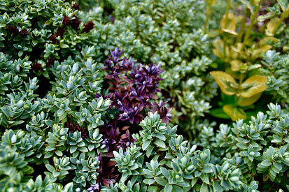
This is my best picture I have edited because of the vast colour palette and the clearest photograph. The colours are bursting and very saturated making the plant look very healthy and vibrant. The focus point is the close up parts of the bush which are very detailed and look almost as if they're 3D coming out of the screen. The ones at the back are in more of a blurred focus which still sets a nice back drop for the foliage in the front. It looks professional due to the crisp nature and high quality footage produced by the camera, the focus makes for different components of each level of clarity.
Here are some of the other options I had
Subscribe to:
Comments (Atom)
Final Website Screenshots Page 2 ABOUT
Please be aware that there is a major collaboration at the bottom of the page as the band have made music for the next Spiderverse movie. Th...

-
https://vimeo.com/manage/videos/875969526 It is also on my website home page, watch in 1080p


